Measuring Accessibility for San Francisco Students: A Geospatial Analysis of Parks, Transit, and School Environments
Aiji Li, Anika Sikka, Danielle Murphy, Kathryn Sun (Group 26)
Intro: Problem And Motivation
Access to public transportation, parks, and recreational spaces plays a critical role in shaping students’ daily experiences, influencing how easily they can travel to school, participate in after-school activities, and engage with their surrounding neighborhoods. These forms of accessibility might vary substantially across space, reflecting historical patterns of infrastructure investment, land use, and neighborhood development. Understanding how these spatial disparities manifest around schools is essential for evaluating educational equity and identifying areas where students may face structural barriers to mobility and access to public space.
In this project, we investigate spatial patterns of transit accessibility and park access for middle and high schools across San Francisco. Using geospatial analysis, we examine how access to public transportation and parks varies in the areas immediately surrounding schools, and whether these patterns differ systematically between public and private institutions. Rather than focusing solely on proximity, we adopt accessibility-based measures that incorporate walkability, service frequency, and neighborhood context, providing a more realistic representation of students’ lived access to urban infrastructure.
To conduct this analysis, we integrate multiple geospatial datasets, including public and private school locations from Oak Ridge National Laboratory (2025), OpenStreetMap street networks processed with OSMnx for walkability analysis, San Francisco Recreation & Parks data for green-space accessibility, San Francisco Planning’s 2023 Land Use dataset, and U.S. Census ACS 5-Year Estimates for demographic context. All datasets were cleaned, projected, and analyzed using GeoPandas, enabling consistent spatial joins, distance-based calculations, and visualization.
The findings of this project are relevant to urban planners, transportation agencies, and policymakers concerned with educational equity. By identifying spatial disparities and clusters of high or low accessibility around schools, this analysis can help inform targeted investments in transit service, pedestrian infrastructure, and public spaces, particularly in neighborhoods where students may face compounded access constraints.
Research Questions
Overall Research Question:
How does access to public transportation and parks vary spatially across schools
in San Francisco, and to what extent are these accessibility patterns clustered
at the neighborhood level?
Do schools exhibit localized clusters of high or low transit accessibility,
as measured by spatial autocorrelation metrics?
How stable are observed transit accessibility patterns across different times
of day?
How are park accessibility and transit accessibility, as defined in this study,
related to one another?
Methods
Creating a Transit Accessibility Score
When considering transit accessibility, which has no universal
definition, there are a variety of methodologies used to examine the concept.
As discussed in
Chung (Review of Transit Accessibility Measures)
,
one group of approaches includes distance-based methods,
such as Public Transport Accessibility Level (PTAL), which is commonly used
in the United Kingdom.
PTAL incorporates average waiting time based on service frequency and
reliability. This provides more insight than simple stop counts, as it
accounts for how often transit service is available and how reliable it is.
Other approaches discussed in the literature include
gravity-based methods, which assign weights to destinations,
and utility-based accessibility measures, which apply a
utility function to urban opportunities. Due to the complexity of these
approaches, we construct a score inspired by PTAL as a reasonable and
interpretable metric for transit accessibility.
Computing the Accessibility Score
Data Integration
School–stop walking times are joined with stop–route service frequency data
using stop_id, enabling integration of pedestrian access and
transit supply.
Accessibility Weight Formulation
To combine transit supply with walking access, an
Accessibility Weight (AW) is computed for each
school–stop–route combination:
AW = (vehicles per hour) / (walk time + α)
where α is a fixed penalty term (set to 2.0) that prevents
extremely small walking times from disproportionately inflating the score.
Best-Stop Selection
For each school and transit route, only the stop with the maximum
accessibility weight is retained. This reflects the assumption that travelers
will choose the most accessible boarding point for a given route.
The Accessibility Weight captures a stop’s contribution to a school’s public
transit accessibility. The weight increases with higher service frequency and
is downweighted by walking time.
The formulation models diminishing returns: the difference between a 2- and
4-minute walk is more consequential than the difference between a 12- and
14-minute walk. This reflects the tendency for longer walking distances to
strongly reduce perceived transit convenience.
Examples of Accessibility Weight
Same Frequency of Service
Stop
Walk Time (min)
Frequency
Accessibility Weight
A
3
12/hr
2.4
B
8
12/hr
1.2
Frequent vs. Infrequent Service
Stop
Walk Time (min)
Frequency
Accessibility Weight
C
4
15/hr
2.5
D
4
5/hr
0.83
To avoid double-counting transit service that appears at multiple nearby
stops for the same route, we do not sum across all reachable stops. Instead,
the final transit accessibility score for each school is computed as the sum
of the top five accessibility weights across distinct routes.
Methods of Analysis: Spatial Correlation and LISA Cluster Identification
Spatial autocorrelation in school transit accessibility was assessed using
both Global Moran’s I and
Local Indicators of Spatial Association (LISA).
Global Moran’s I provides an overall measure of spatial dependence by
evaluating whether PTAL scores across all schools are spatially clustered,
dispersed, or randomly distributed.
A positive Global Moran’s I indicates that schools with similar transit
accessibility tend to be located near one another, while values near zero
suggest a spatially random pattern. Statistical significance is assessed
using permutation-based tests.
To identify localized clustering, we applied LISA, which decomposes the
global statistic into school-level measures of spatial association. For each
school, a local Moran’s I statistic is computed using distance-based spatial
weights, comparing the school’s standardized PTAL score to the average PTAL
scores of neighboring schools.
Schools are classified into four cluster types:
High–High: Schools with above-average PTAL scores surrounded
by neighbors with similarly high scores.
Low–Low: Schools with below-average PTAL scores located near
other low-accessibility schools.
High–Low: Spatial outliers with high PTAL scores surrounded
by lower-accessibility neighbors.
Low–High: Spatial outliers with low PTAL scores surrounded
by higher-accessibility neighbors.
Statistical significance for each local classification is evaluated using
permutation-based tests. Only schools with significant local Moran’s I values
are assigned to LISA cluster categories, ensuring that identified clusters
reflect meaningful spatial structure rather than random variation.
Data & Cleaning
511 GTFS Transit Data
Rather than relying on a single operator's feed (e.g., SFMTA), we used the active regional GTFS feed provided by 511, which aggregates schedule data across all publicly available Bay Area transit agencies. This regional feed was accessed via the 511 GTFS Feed Download endpoint by specifying the operator identifier RG, ensuring comprehensive spatial coverage across jurisdictional boundaries
The regional GTFS dataset includes standard GTFS tables such as stops.txt, routes.txt, trips.txt, stop_times.txt, and calendar.txt, which together define transit stop locations, route structures, scheduled vehicle trips, stop-level arrival times, and service calendars. Only static schedule data were used as the analysis focuses on scheduled weekday accessibility rather than live operations. We obtained all descriptions of the data from the General Transit Feed Specification Reference
We selected only routes with route_type in {0,1,2,3} which includes any tram/streetcar/light rail service, subway/metro, rail, or bus service.
Associating Routes with Stops
As a preprocessing step, we identified the set of transit routes serving each
stop. The stop_times, trips, and routes
tables were joined to associate each stop with the unique set of route short
names that serve it.
For each stop, these route identifiers were aggregated into a single
comma-separated list, producing a stop-level dataset in which each transit stop
is annotated with the routes that serve it. This resulting table was then merged
with the stops GeoDataFrame, preserving spatial information for
subsequent distance-based accessibility analysis.
School Data
We use geospatial school data from FEMA’s Resilience Analysis and Planning Tool
(RAPT), which aggregates public and private school information from the Homeland
Infrastructure Foundation-Level Data (HIFLD) database. The dataset includes spatial
locations for each uniquely identified school, along with attributes such as
enrollment and grade span.
Our analysis focuses on schools located within San Francisco city and county
boundaries.
Private School Data
Private school data were obtained from the RAPT ArcGIS Feature Server:
https://services.arcgis.com/XG15cJAlne2vxtgt/arcgis/rest/services/Private_Schools_RAPT/FeatureServer
.
The data were downloaded in GeoJSON format. Each feature included point
coordinates stored as separate x and y values. These
coordinates were converted into Shapely Point geometries and used
to construct a GeoDataFrame with a WGS84 coordinate reference system
(EPSG:4326).
After loading the data, we filtered the dataset to include only schools located
in San Francisco by selecting records whose CITY or
COUNTY fields contained “San Francisco.”
Public School Data
Public school data were downloaded directly from the RAPT interface as a CSV
file and loaded into a GeoDataFrame using the provided latitude and longitude
coordinates.
The public and private datasets are largely similar in structure. The public
school dataset includes two additional fields,
DISTRICTID and GlobalID, which were retained during
processing.
Several columns, such as WEBSITE and SHELTER_ID,
contained a high proportion of missing values and were not relevant to our
analysis. These columns were dropped. A complete list of retained columns is
provided in the appendix.
Classifying School Levels
The public and private school datasets use different systems to encode school
level, requiring separate classification approaches.
Private Schools
Private schools include grade span information via the ST_GRADE and
END_GRADE fields. However, these fields do not directly encode
standard grade levels, and official documentation describing the encoding could
not be located. To interpret these values, we examined all unique
(ST_GRADE, END_GRADE) pairs and verified representative schools
through external web searches.
Several consistent patterns emerged. Known high schools such as ICA Cristo Rey
appeared with ST_GRADE = 14 and END_GRADE = 17,
indicating that codes 14–17 correspond to Grades 9–12. Schools serving Grades
K–8 or 6–8 frequently had END_GRADE = 13, suggesting that 13 encodes
Grade 8. Based on these observations, we classified schools with grade spans of
2–13 or 3–13 as K–8 schools, and those with spans such as 6–13 as middle schools.
A small number of schools required manual inspection. For instance, St.
Ignatius (11–17) was classified as a high school despite its atypical starting
grade code; Mother Goose School (2–4) was identified as a preschool; and San
Francisco Christian School (3–17) serves grades Pre-K through 12. We excluded
the Edgewood Center for Children & Families after determining that it is not
a school.
Using these interpretations, each private school was assigned to one of the
following categories: Elementary, K–8, Middle, High, Preschool, or Other.
Public Schools
Public schools are classified using a more descriptive categorical field,
LEVEL_. We mapped these values to broader categories using the
following dictionary:
The schools classified as Other are San Francisco Christian School
(K–12), Five Keys Adult School, and San Francisco County Special Education. For
the remainder of our analysis, we focus primarily on Elementary, K–8, Middle,
and High schools.
Cleaning Enrollment Data
We next cleaned the enrollment field by converting negative enrollment values
to missing values. No private schools contained invalid enrollment values.
However, 9 out of 133 public schools had negative or zero enrollment values.
These included seven early education or children’s centers, one adult school,
and one high school.
Upon further investigation, the high school with invalid enrollment data,
Leadership High, was found to be permanently closed and was removed from the
dataset.
Final School Dataset Construction
The cleaned public and private datasets were concatenated into a single
GeoDataFrame, schools_sf. Any columns missing from one dataset were
added with null values, and columns were reordered to ensure schema consistency.
Finally, we created a unique school_id for each school based on its
index and confirmed that all geometries were stored in WGS84 coordinates.
Parks Data
We used the City of San Francisco parks/open space dataset (CSV) containing one row per park property, including a WKT geometry field (shape) plus basic metadata such as name, address, acreage, and neighborhood labels.
Loading + geometry
The raw parks table included a shape column storing geometries as WKT strings. We converted that text geometry into shapely objects and built a GeoDataFrame in WGS84:
parks["geometry"] = parks["shape"].apply(wkt.loads)
parks = gpd.GeoDataFrame(parks, geometry="geometry", crs="EPSG:4326")
Cleaning
Minimal cleaning was needed beyond geometry parsing. We kept the dataset at full extent (San Francisco parks), and relied on the provided latitude/longitude + geometry for mapping and spatial joins.
Muni Data
Upon obtaining SFMTA Muni stop data as a GeoJSON file, we dissected the dataset and then performed analysis in conjunction with our preexisting school dataset. Each feature in the dataset contained geographical information about the stops. We reprojected the geometry to ensure spatial consistency with the school isochrone data.
To measure transit accessibility around schools, we performed a spatial join of the Muni stops dataset with the 15-minute walking isochrones computer above. We then grouped the joined dataset by school index to aggregate all stop counts for each school.
Our data visualization followed our usual practices - we created a color scale based on the maximum number of Muni stops within any school’s isochrone and applied it to the polygons. The darker the shade of the polygon, the more Muni stops existed for that specific school.
From this initial visualization, we were also curious about the existence of “transit deserts,” areas where students may face reduced access to public transportation. To locate transit deserts around schools, we examined the empirical distribution of stop counts and summary statistics, including the median the interquartile range. We then classified schools into three transit accessibility categories based on the quartiles:
Transit Desert: schools in the bottom 25% of Muni stop counts
Moderate Access: schools between the 25th and 75th percentiles of Muni stop counts
High Access: schools in the top 25% of Muni stop counts
The use of quantiles allows us to identify relative transit disadvantages without imposing a cutoff. It ensures that the definition of a transit desert is based on the observed distribution of access across schools.
To visualize the transit accessibility categories, we created an interactive map similar to our other maps in which each school’s 15-minute isochrone is colored accordingly (red for Transit Desert, yellow for Moderate Access, and green for High Access).
Our Muni data results provide a clear baseline to complement our PTAL analysis presented later in the paper.
Results
Parks and Recreation Access
Using 15-minute walking isochrones around each school, we counted the number
of parks intersecting each school’s walkable catchment area. This provides a
simple and interpretable proxy for the availability of parks and recreation
spaces reachable on foot from schools.
Across the 183 schools in our dataset, the median school can reach 6 parks
within a 15-minute walk (interquartile range 4–10), with a mean of 7.0 parks.
Park access varies substantially across locations, ranging from 0 to 19
reachable parks. While most schools have access to several nearby parks, a
small subset of schools have very limited access, highlighting localized gaps
in park availability that may warrant further attention.
Park accessibility varies across individual schools but shows only modest
differences by school level. Elementary schools have a median of 7 parks
within a 15-minute walk (interquartile range 4–11), while K–8 and high schools
have similar medians of 6.5 and 6 parks, respectively. Middle schools exhibit
slightly lower access, with a median of 5 parks, though their interquartile
range overlaps substantially with other school types.
Distribution of the number of reachable parks within a 15-minute walk,
grouped by school level.
Preschools exhibit higher average park counts; however, this category includes
only seven schools and should be interpreted with caution. Overall, the
substantial overlap in park-access distributions across school levels suggests
that proximity to parks is driven primarily by neighborhood location rather
than school type.
Elementary and K–8 schools display slightly higher median park access compared to middle and high schools, as well as wider interquartile ranges. However, these differences should be interpreted with caution, as elementary and K–8 schools are substantially more numerous in the dataset than middle and high schools. The larger sample sizes for these school levels naturally produce more stable estimates and greater observed variability, while the smaller number of middle and high schools results in more compact distributions that may underrepresent the full range of park accessibility experienced by those school types.
In addition to sample size effects, these patterns likely reflect differences in spatial distribution. Elementary and K–8 schools are more broadly dispersed across residential neighborhoods, where park availability varies considerably from block to block. Middle and high schools, by contrast, are fewer in number and tend to be more spatially clustered, often located along denser corridors where park availability may be constrained. As a result, the narrower distributions observed for middle and high schools may reflect both their limited sample size and their concentration in specific urban contexts rather than inherently more uniform access.
Notably, the substantial overlap in park-access distributions across all school levels indicates that neighborhood location plays a more important role in shaping park accessibility than school level alone. Schools of different types located in the same neighborhoods tend to experience similar access to nearby parks, reinforcing the interpretation that park accessibility is primarily a spatial rather than institutional phenomenon.
Summary Statistics
School Level
Count
Median
25%
75%
Mean
Min
Max
Elementary
88
7
4
11
7.63
1
19
High
33
6
3
8
6.18
1
14
K–8
32
6.5
4.75
10
7.09
1
16
Middle
19
5
3
8.5
5.84
1
12
Other
3
4
3.5
4.5
4.00
3
5
Preschool
7
8
5
12.5
9.14
4
17
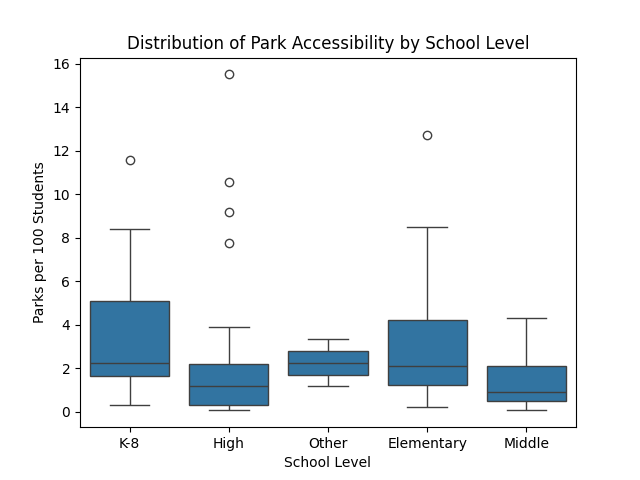
Scaling by Enrollment
To account for differences in school size, we also compute park access
normalized by enrollment, measured as the number of reachable parks per 100
students. To avoid distortion from very small schools, this metric is computed
only for schools with enrollment of at least 50 students.
Interactive map showing park accessibility for schools, measured as the
number of reachable parks within a 15-minute walk.
Public Transit Accessibility Score Results
Understanding access to public transportation is critical in evaluating how easily students, families, and school staff can travel to and from schools without relying on private vehicles. Public transit accessibility influences daily commuting, after-school activities, and equitable access to educational opportunities, particularly in dense urban environments like San Francisco where transit availability varies substantially by neighborhood.
Before presenting the advanced frequency-weighted PTAL results, we introduce a simpler baseline measure of transit accessibility: the number of Muni stops reachable within a 15-minute walking isochrone around each school. The following 2 maps show the 15-Minute Walk Accessibility to Muni Stops for middle and high schools respectively
Walk Accessibility to Muni Stops
15-Minute Walk Accessibility to Muni Stops for Middle Schools
15-Minute Walk Accessibility to Muni Stops for High Schools.
This metric extends and allows us to visually identify transit deserts. We focused on middle and high schools only, as these students are more likely to independently rely on public transportation to get around. Schools were categorized into transit deserts (bottom 25%), moderate access (middle 50%), and high access (top 25%), and visualized using colored isochrones.
Transit Deserts: Middle and High Schools
This reveals transit deserts (categorized by access level) for middle and high schools in the SF area.
The resulting map reveals several transit-poor areas, most of which are away from downtown. Schools with more nearby Muni stops are more evenly distributed around the city rather than being concentrated exclusively in central SF. Compared to the PTAL results, this shows less emphasis on downtown accessibility and instead highlights neighborhood-level differences in transit availability. While this metric does not capture frequency, reliability, or access to non-Muni transportation, it is an interesting and useful first step for identifying inequalities in transit access.
Public transit accessibility plays a critical role in determining how easily
students, families, and school staff can travel to and from schools without
relying on private vehicles. To quantify transit access, we use the Public
Transit Accessibility Level (PTAL), a composite measure that captures both the
proximity of transit stops and the frequency of service available within a
walkable catchment area.
PTAL scores were computed using weekday service data, with a primary focus on
the morning peak period (7–10 AM). Additional time windows, including midday
off-peak (10 AM–2 PM) and evening peak (4–7 PM), were analyzed to assess the
temporal robustness of accessibility patterns.
PTAL Score Distribution
PTAL scores by school level during the morning peak
period.
PTAL scores are broadly similar across school levels, with overlapping
interquartile ranges and mean values between approximately 4.8 and 5.7. No
school level consistently exhibits substantially higher or lower transit
accessibility, suggesting that PTAL primarily reflects neighborhood-level
transit infrastructure rather than institutional characteristics.
Spatial Structure of Transit Accessibility
Using distance-based spatial weights (1.5 km threshold), we find significant
positive spatial autocorrelation in PTAL scores (Moran’s I = 0.47, p = 0.001),
indicating that transit accessibility is spatially clustered rather than
randomly distributed across schools.
Local Indicators of Spatial Association (LISA) clusters for PTAL scores.
The figure reveals a pronounced spatial structure in transit accessibility across San Francisco schools. Using distance-based spatial weights (1.5 km threshold), we find strong positive global spatial autocorrelation in PTAL scores (Moran’s I = 0.47, p = 0.001), indicating that schools with similar levels of transit accessibility are significantly clustered in space rather than randomly distributed. This result confirms that transit accessibility is fundamentally a neighborhood-scale phenomenon shaped by the underlying organization of the transit network.
The LISA cluster map further clarifies the nature of this spatial dependence by identifying localized concentrations of high and low accessibility. High–High clusters are concentrated in central and downtown San Francisco, corresponding to areas with dense, frequent, and multimodal transit service. These neighborhoods benefit from overlapping bus, rail, and metro routes with short headways, resulting in consistently high PTAL scores for nearby schools. The spatial contiguity of these clusters highlights how transit-rich corridors create reinforcing accessibility advantages across multiple nearby schools.
In contrast, Low–Low clusters are primarily located in the Sunset District and parts of southern San Francisco. Schools in these areas are surrounded by neighbors with similarly low PTAL scores, reflecting sparser route coverage, longer headways, and fewer high-frequency transit options. The persistence of Low–Low clusters suggests that transit-poor conditions are not isolated anomalies but rather systemic characteristics of certain neighborhoods, potentially reinforcing inequities in students’ daily mobility and access to opportunities.
The presence of High–Low and Low–High clusters indicates localized spatial outliers where a school’s transit accessibility differs sharply from that of its surrounding neighbors. These cases may reflect proximity to a single high-frequency corridor embedded within an otherwise transit-poor area, or conversely, schools located slightly off major transit spines within otherwise well-served neighborhoods. Such outliers underscore the importance of fine-grained spatial analysis: even within broadly transit-rich or transit-poor areas, access can vary meaningfully at short distances.
Notably, a substantial share of schools are classified as not locally significant, suggesting that while strong clusters exist, transit accessibility often varies smoothly across space rather than forming sharply bounded regions.
These results suggest that future work should examine neighborhoods classified as low–low clusters in greater detail to identify the structural, infrastructural, or policy factors underlying these observed disparities.
Temporal Robustness of PTAL
Animated map showing PTAL scores across multiple weekday time periods.
While absolute PTAL values change modestly across time windows, the overall
spatial structure remains highly stable. This consistency supports the use of
morning peak PTAL values for all primary analyses.
Relationship Between Park and Transit Accessibility
Relationship between PTAL scores and park accessibility, colored by school
level.
We observe a moderate positive association between transit accessibility and
park accessibility (Spearman’s ρ = 0.38). Schools with higher levels of transit
access tend, on average, to have greater access to parks, though substantial
variability remains.
Differences across school levels are visible, with elementary and K–8 schools
more frequently appearing among observations with higher park accessibility.
Overall, transit and park accessibility represent related but distinct
dimensions of the urban environment.
Limitations and Dark Data
Several limitations and sources of dark data should be considered when
interpreting the results of our transit and park accessibility analyses. Dark
data refers to relevant information that is unavailable, unobserved, or
difficult to measure, but which nonetheless shapes real-world experiences and
outcomes.
First, while the Public Transit Accessibility Level (PTAL) provides a useful
relative measure of transit availability across schools, its absolute values
are not directly interpretable in isolation. PTAL is best understood as a
comparative metric rather than a literal measure of travel time or service
quality.
Our PTAL metric is derived from static GTFS schedule data, which represent
planned service rather than observed transit operations. This introduces an
important form of dark data: real-time transit conditions. Delays,
cancellations, crowding, and reliability—factors that strongly affect how
accessible transit feels in practice—are not captured by scheduled data. As a
result, schools located along routes with frequent scheduled service may still
experience lower effective accessibility during periods of disruption.
In addition, the walking-access component of PTAL assumes uniform pedestrian
conditions and does not account for dark data related to sidewalk quality,
traffic safety, topography, or perceived comfort. These factors influence
whether transit is realistically usable by students but are not represented in
the available datasets.
More broadly, our operationalization of transit accessibility reduces access to
the number and frequency of scheduled vehicles serving nearby stops. While this
is a reasonable proxy, it does not capture directional relevance or trip
purpose, which represent additional forms of dark data. For example, routes
serving a school may not connect to students’ home neighborhoods, after-school
destinations, or workplaces, meaning that high PTAL scores may not translate
into meaningful mobility for all students.
Park accessibility measures are also affected by dark data. We measure park
access based on spatial proximity alone, counting parks that intersect a
school’s walkable catchment area. This approach does not capture qualitative
differences among parks, such as size, programming, safety, maintenance, or
hours of access. A park may be geographically nearby but effectively
inaccessible to students due to fencing, limited amenities, or perceived
safety concerns.
Additionally, enrollment data were incomplete or unreliable for a small number
of schools, particularly early education centers and adult education
facilities. Although we removed closed schools and applied minimum enrollment
thresholds when computing enrollment-normalized park metrics, residual
inaccuracies in enrollment figures represent another source of dark data that
may affect scaled accessibility measures.
Finally, all analyses are conducted at the school level, which introduces
limitations related to the modifiable areal unit problem (MAUP) and ecological
fallacy. School-level accessibility metrics obscure individual-level variation
and behavior—another form of dark data. We do not observe which transit routes
students actually use, how frequently they visit nearby parks, or how access
differs across student populations within the same school. These unobserved
behavioral and demographic factors limit the ability to draw individual-level
or causal conclusions about accessibility and equity outcomes.
Appendix
SF Schools Dataset
Column Name
Description
Data Type
address
Street address of the school
string
city
City name
string
country
Country (e.g., USA)
string
county
County name
string
countyfips
County FIPS code
string
districtid
District identifier
string
end_grade
Ending grade code
string
enrollment
Student enrollment count
float
fid
Feature ID from source
int
ft_teacher
Number of full-time teachers
int
geometry
School point geometry
geometry
globalid
Global unique identifier
string
latitude
Latitude coordinate
float
level_
Source school level label
string
level_clean
Cleaned school level label
string
longitude
Longitude coordinate
float
naics_code
NAICS classification code
string
naics_desc
NAICS description
string
name
School name
string
ncesid
NCES school identifier
string
population
Population field from source
int
source
Source/provider label
string
source_dat
Source date/vintage
string
st_grade
Starting grade code
string
state
State abbreviation
string
status
Operational status
string
telephone
Phone number
string
type
School type code
string
val_date
Validation date
string
val_method
Validation method
string
zip
ZIP code
string
zip4
ZIP+4 extension
string
school_id
Generated unique school ID
int
Parks Dataset
Column Name
Description
Data Type
objectid
Source object ID
int
property_id
Park property identifier
int
property_name
Name of the park
string
longitude
Longitude coordinate
float
latitude
Latitude coordinate
float
acres
Area in acres
float
squarefeet
Area in square feet
string
perimeterlength
Perimeter length
string
propertytype
Property type
string
address
Street address
string
city
City name
string
state
State abbreviation
string
zipcode
ZIP code
int
complex
Complex grouping
string
psa
Police Service Area
string
ownership
Ownership category
string
supdist
Supervisor district
string
analysis_neighborhood
Analysis neighborhood
string
shape
Geometry (text)
string
created_date
Created timestamp
string
last_edited_date
Last edited timestamp
string
data_as_of
Data currency timestamp
string
data_loaded_at
Data load timestamp
string
GTFS Stops Dataset
Column Name
Description
Data Type
stop_id
Unique stop ID
string
stop_code
Public stop code
string
stop_name
Stop name
string
tts_stop_name
Text-to-speech name
string
stop_desc
Stop description
string
stop_lat
Latitude
float
stop_lon
Longitude
float
zone_id
Fare zone
string
stop_url
Stop webpage
string
location_type
Location type
integer
parent_station
Parent station
string
stop_timezone
Timezone
string
wheelchair_boarding
Wheelchair access
integer
level_id
Station level ID
string
platform_code
Platform code
string
stop_access
Access type
integer
GTFS Routes Dataset
Column Name
Description
Data Type
route_id
Route ID
string
agency_id
Agency ID
string
route_short_name
Short route name
string
route_long_name
Long route name
string
route_desc
Route description
string
route_type
Transit mode
integer
route_url
Route webpage
string
route_color
Route color
string
route_text_color
Text color
string
route_sort_order
Sort order
integer
continuous_pickup
Pickup policy
integer
continuous_drop_off
Drop-off policy
integer
network_id
Network ID
string
cemv_support
Contactless payment
integer
GTFS Trips Dataset
Column Name
Description
Data Type
route_id
Route ID
string
service_id
Service ID
string
trip_id
Trip ID
string
trip_headsign
Trip destination
string
trip_short_name
Short trip name
string
direction_id
Direction
integer
block_id
Block ID
string
shape_id
Shape ID
string
wheelchair_accessible
Wheelchair access
integer
bikes_allowed
Bikes allowed
integer
cars_allowed
Cars allowed
integer
GTFS Stop Times Dataset
Column Name
Description
Data Type
trip_id
Trip ID
string
arrival_time
Arrival time
string
departure_time
Departure time
string
stop_id
Stop ID
string
stop_sequence
Stop order
integer
pickup_type
Pickup policy
integer
drop_off_type
Drop-off policy
integer
shape_dist_traveled
Distance traveled
float
timepoint
Exact vs estimated
integer
GTFS Calendar Dataset
Column Name
Description
Data Type
service_id
Service ID
string
monday
Runs Monday
integer
tuesday
Runs Tuesday
integer
wednesday
Runs Wednesday
integer
thursday
Runs Thursday
integer
friday
Runs Friday
integer
saturday
Runs Saturday
integer
sunday
Runs Sunday
integer
start_date
Start date
string
end_date
End date
string
Muni Stops Dataset
Column Name
Description
Data Type
OBJECTID
Source object ID
int
STOPNAME
Stop name
string
TRAPEZESTOPABBR
Trapeze stop abbreviation
string
RUCUSSTOPABBR
RUCUS stop abbreviation
string
STOPID
Muni stop ID
int
LATITUDE
Latitude
float
LONGITUDE
Longitude
float
ACCESSIBILITYMASK
Accessibility flag
float
ATSTREET
Cross street
string
ONSTREET
Street name
string
POSITION
Curb position
string
ORIENTATION
Orientation
string
SERVICEPLANNINGSTOPTYPE
Stop type
string
SHELTER
Shelter indicator
int
SUPERVISOR_DISTRICT
Supervisor district
float
shape
Geometry text
string
data_as_of
Data currency timestamp
string
data_loaded_at
Load timestamp
string
References
Chung, E., Chung, Y., & Lee, J. (2014).
A review of transit accessibility measures.
Journal of Transport Geography, 40, 1–10.
Link
Anselin, L. (1995).
Local indicators of spatial association—LISA.
Geographical Analysis, 27(2), 93–115.
DOI
Oak Ridge National Laboratory. (2025).
Private Schools RAPT [ArcGIS Feature Service].
ArcGIS Service
Oak Ridge National Laboratory. (2025).
Public Schools [ArcGIS Feature Layer].
ArcGIS Service
Federal Emergency Management Agency. (2024).
Resilience Analysis and Planning Tool (RAPT).
Website
Metropolitan Transportation Commission. (2025).
511 Bay Area GTFS Transit Data.
Open Data Portal
Boeing, G. (2017).
OSMnx: New methods for acquiring, constructing, analyzing, and visualizing complex street networks.
Computers, Environment and Urban Systems, 65, 126–139.
DOI